Nachricht für neue Nutzer.
Nachricht für engagierte Nutzer.
How to draw a Poster: Unterschied zwischen den Versionen
Aus ZUM-Unterrichten
Main>Theli34 (Die Seite wurde neu angelegt: *What is your Topic? => Clear and easy-to-remember headline! *Collect what you want to write on your poster on a sheet of paper first! (Mindmap?) *Less is more! If ther...) |
(+posters) Markierung: Quelltext-Bearbeitung 2017 |
||
| (14 dazwischenliegende Versionen von 5 Benutzern werden nicht angezeigt) | |||
| Zeile 1: | Zeile 1: | ||
*What is your Topic? => Clear and easy-to-remember headline! | *What is your Topic? => Clear and easy-to-remember headline! | ||
*Collect what you want to write on your poster on a sheet of paper first! (Mindmap?) | *Collect what you want to write on your poster on a sheet of paper first! ([[Mindmap]]?) | ||
*Less is more! If there is too much on your poster, it will be difficult to read! | *Less is more! If there is too much on your poster, it will be difficult to read! | ||
*How big will your poster be? Draw a sketch of your poster first: | *How big will your poster be? Draw a sketch of your poster first: | ||
* | **What will be where? How big can my headline, pictures, texts be? | ||
*Divide your poster either horizontally (halves) and/or vertically (two or more columns) into parts! => Place your material within those sections. Give your poster a clear structure! | *Divide your poster either horizontally (halves) and/or vertically (two or more columns) into parts! => Place your material within those sections. Give your poster a clear structure! | ||
*Write the single parts of your texts / draw your illustrations on smaller sheets of paper first! Fix them on the poster at the end! | *Write the single parts of your texts / draw your illustrations on smaller sheets of paper first! Fix them on the poster at the end! | ||
* | **If you make a mistake, you needn’t write it all again! | ||
* | **Different people can work on different parts at the same time! | ||
**You can first try where you want to put the single parts and how ‘big they may be’. | **You can first try where you want to put the single parts and how ‘big they may be’. | ||
*Use clear and rather ‚big’ letters for what you write (min. 1 cm high/ 18 pt). | *Use clear and rather ‚big’ letters for what you write (min. 1 cm high/ 18 pt). | ||
*If you use pictures and colours, be careful! Don’t use too many different colours! Use the same ones e.g. for all headlines … Ask yourself: | *If you use pictures and colours, be careful! Don’t use too many different colours! Use the same ones e.g. for all headlines … Ask yourself: | ||
* | **What does this picture show/explain? Is it big enough and easy to understand? | ||
* | **Can people easily ‘read’ the colourful letters against the background of the poster? | ||
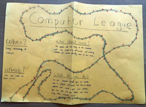
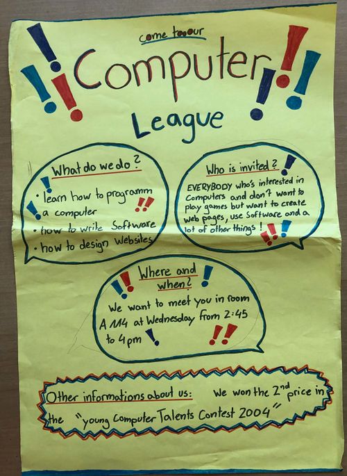
{{aufgabe-en|Take a look at these two posters. What would you do differently / better?}} | |||
[[Datei:Poster-bad.jpg|500px]] | |||
[[Datei:Poster-good.jpg|500px]] | |||
{{clear}} | |||
{{How to}} | |||
== Siehe auch == | |||
* [[Mindmap]] | |||
* [[Präsentieren]] | |||
[[Kategorie:Englisch]] | |||
[[Kategorie:Unterrichtsidee]] | |||
[[Kategorie:Methode]] | |||
Aktuelle Version vom 25. Januar 2023, 08:00 Uhr
- What is your Topic? => Clear and easy-to-remember headline!
- Collect what you want to write on your poster on a sheet of paper first! (Mindmap?)
- Less is more! If there is too much on your poster, it will be difficult to read!
- How big will your poster be? Draw a sketch of your poster first:
- What will be where? How big can my headline, pictures, texts be?
- Divide your poster either horizontally (halves) and/or vertically (two or more columns) into parts! => Place your material within those sections. Give your poster a clear structure!
- Write the single parts of your texts / draw your illustrations on smaller sheets of paper first! Fix them on the poster at the end!
- If you make a mistake, you needn’t write it all again!
- Different people can work on different parts at the same time!
- You can first try where you want to put the single parts and how ‘big they may be’.
- Use clear and rather ‚big’ letters for what you write (min. 1 cm high/ 18 pt).
- If you use pictures and colours, be careful! Don’t use too many different colours! Use the same ones e.g. for all headlines … Ask yourself:
- What does this picture show/explain? Is it big enough and easy to understand?
- Can people easily ‘read’ the colourful letters against the background of the poster?
Task
Take a look at these two posters. What would you do differently / better?
How to …


